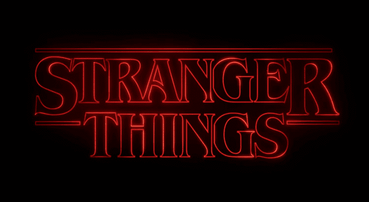
The “Stranger Things logo” is an iconic design that has become synonymous with the popular Netflix series of the same name. The logo features a retro 1980s-inspired style, paying homage to the nostalgic setting of the show.
The design consists of bold, red letters against a black background, with a slight distortion and glow effect, reminiscent of old VHS tapes and classic movie posters from the ’80s. The letters are arranged in a stacked format, forming the title “Stranger Things.”
The font used in the logo is reminiscent of the Stephen King book covers and movie posters of the 1980s, adding to the show’s nostalgic vibe and horror-genre theme.
Overall, the “Stranger Things” logo encapsulates the essence of the show – a thrilling, mysterious, and nostalgic journey that takes viewers back to a world of supernatural adventures and 1980s pop culture references.
READ MORE: Woman photographs 100 pictures of penises – for truly inspiring reason says Mirror
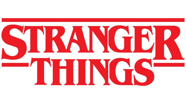
Stranger Things Logo
| Description | English: Stranger Things logoFrançais : Logo de la série télévisée Stranger Things.Oʻzbekcha / ўзбекча: G’alati narsalar logotip |
| Date | 22 July 2016 |
| Source | Netflix |
| Author | Netflix |
What is the Stranger Things symbol Logo?
For each season the logo was modified in one main thing — the number was added to the iconic red wordmark, and each time it was set in one style, supporting the concept.
Stranger Things Logo 2016 (Season 1)
The Stranger Things logo, introduced in 2016, featured a bold two-leveled inscription in the uppercase, executed in a strongly contoured serif typeface, in red. The lettering was accompanied by one long horizontal line, covering it on top, and two short ones on the sides from the “Things”, underlining two enlarged letters of the “Stranger”, “S” and “R”.
When set against a black background, the contours of the Stranger Things badge got set in neon, with the blurred edges of the lines in a slightly lighter shade of red.
Stranger Things Logo 2017 (Season 2)
With the release of the second season of Stranger Things, the new logo was introduced in 2017. It was the same style of the lettering, but executed in gradient lines, from orange to red, and accompanied by a bold dark red-to-black numeral “2”, enlarged and placed on the background of the logo.
Despite the change of the contours’ color to a more vivid orange one; the whole mood of the badge didn’t get lighter, and the drama level was still as high as in the original version.
Stranger Things Logo 2019 (Season 3)
The logo for the Stranger Things 3 saw the light in 2019. It was executed in the same style as the two previous versions, but with the bodies of the letters turned black, and outlined in red. The inscription was overlapping the enlarged numeral “3” set in red-to-black gradient shades and featured sharp clean lines of the contours.
Stranger Things Logo 2021 (Season 4)
For the fourth part of the Netflix project, the new badge was created in 2021. The lettering in the recognizable contoured serif fit gained a transparent gray shade and was now set on a background with the enlarged numeral “4”, which repeated the color palette of the “3” from the previous logo but had its lines drawn more elegantly, with curved and sharp angles.
Stranger Things Logo Today
The Stranger Things logo, which has been used by the project since its launch in 2016, is based on the sharp and elegant two-leveled inscription, set in a custom Benguiat typeface, with three additional horizontal lines, set above the top level of the badge and on the sides from it.
The official badge of the project is usually set in plain flat red, against a black or white background, and sometimes is stylized as a red brine banner.
Review of “Stranger Things”: An Entertaining Fusion of Nostalgia and Mystery
“Stranger Things” is an enthralling TV series that has captured the hearts of audiences worldwide since its debut in 2016. Created by the Duffer Brothers, Matt, and Ross Duffer, the show is a brilliant homage to 1980s pop culture, seamlessly blending elements of horror, science fiction, and coming-of-age drama.
The Plot: Set in the fictional town of Hawkins, Indiana, in the 1980s, “Stranger Things” begins with the mysterious disappearance of a young boy named Will Byers. As his friends and family search for him, they encounter a girl with psychokinetic abilities, known only as Eleven, who has escaped from a government laboratory where unethical experiments were conducted.
As the series progresses, the characters find themselves entangled in a web of supernatural events and government conspiracies. The show deftly weaves together storylines involving parallel dimensions, supernatural creatures, and a sinister government agency that seeks to exploit these extraordinary occurrences.
The seamless integration of horror, suspense, and heartwarming relationships between the characters makes “Stranger Things” a captivating watch.
The History of the Stranger Things Logo (2016-2019): The iconic Stranger Things logo, designed by the creative agency Imaginary Forces, made its debut in 2016. It features the title “Stranger Things” set against a backdrop reminiscent of an 80s neon sign, with letters placed vertically and distorted.
The logo’s nostalgic charm quickly became synonymous with the show’s retro-inspired theme and added to its overall allure.
The Inspiration Behind the Stranger Things Logo: The creators, Matt and Ross Duffer, sought to pay homage to the visual aesthetics of the 1980s, a decade rich with iconic designs, movie posters, and arcade culture.
The show’s creators, as fans of the era themselves, wanted the logo to evoke a sense of nostalgia while also intriguing potential viewers with its mysterious and enigmatic appearance.
The Type of Font Used for the Logo: The font used for the Stranger Things logo is called “ITC Benguiat.” Designed by Ed Benguiat in 1977, the font is instantly recognizable for its unique and slightly distorted letterforms.
It perfectly encapsulates the show’s retro vibe and echoes the typography often seen in 80s movie posters and book covers.
In conclusion, “Stranger Things” is a remarkable TV series that successfully marries a captivating plot with nostalgic references to 1980s pop culture. The Duffer Brothers’ creativity shines through as they skillfully blend elements of horror, sci-fi, and heartfelt drama into a compelling narrative.
The Stranger Things logo, with its retro-inspired design and clever use of the ITC Benguiat font, further enhances the show’s allure, leaving an indelible impression on both fans of the 80s and modern audiences alike.
Whether you’re a fan of thrilling mysteries or a lover of nostalgic entertainment, “Stranger Things” is undoubtedly worth a binge-watch.
Source: https://commons.wikimedia.org/wiki/File:Stranger_Things_logo.png